Data Can Help You Improve Investor Reports
Let’s talk about making your Investor and Management reporting data-driven:


Let’s talk about making your Investor and Management reporting data-driven:

Monthly active users – shows how many unique users have been active in a product/service/app on a monthly basis

Groups the revenue by country. Great for companies who started to expand into new markets

The results of a customers satisfaction survey

Company profits per a dollar of sales (interest and tax not considered)
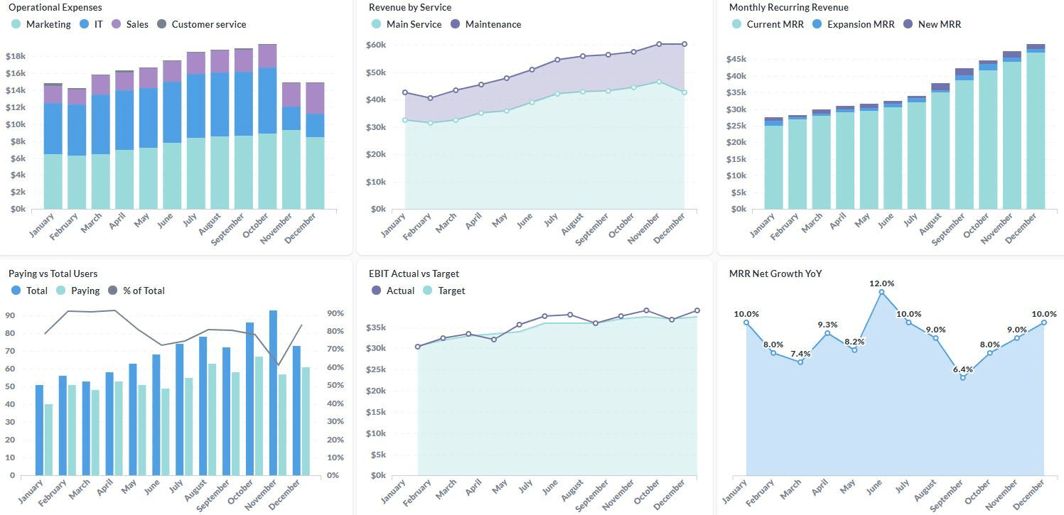
Having accurate KPIs and Metrics that show the performance of your company is a strong prerequisite for successful leadership. Timely, consistent, and accurate insights from your data will give you the ability to make an informed decision. SageData Management Reports helps data-driven leaders understand everything from ROI% on your spend to Balanced Scorecard that displays YoY and MoM performance of your key metrics updated hourly. In our example Management report shown below, the Operational Expenses chart shows the cost distribution among different departments, together with the total cost. A Revenue by Service chart is a great way to see the breakdown of all revenue between the main service and the maintenance activities. The Monthly Recurring Revenue (MRR) breakdown highlights not only the growth of the MRR but also the portions of this growth that are attributed to the New MRR (new customers) and to the Recurring MRR (up-selling to the current clients).
At SageData you always own your data, we help you make sense of it
The number of total users, the number of paying users and what percentage of the users are paying
Earnings before interest and tax – shows to what extent is the company reaching its financial goals (in terms of earnings before interest and tax)
The percentage change in MRR in comparison to the same month last year
Customer acquisition cost as a percentage of customer lifetime value – that comparison shows what percentage of the total revenue the average customer would bring, is spent on acquiring them
Average revenue per user – how much revenue the company is generating per user
Average revenue per paying user – how much revenue the company is generating per paying user
Daily active users – the number of users that have been active on a daily basis
Shows what percentage of people performed a certain action (usually buying) after visiting a website
Connect to 100+ data sources such as Facebook, Instagram, Stripe, Google and many more.
Load the data into your own Data Warehouse and apply your KPIs and Metrics.
Easily visualise your data. Integration-to-Chart time under 10 minutes!
“Every day that goes by when you do not have accurate data to make decisions, is the day when you use intuition to make decisions”
You need a report for another department? See what else we can do:


Get our FREE ebook on the best practices in data visualization: